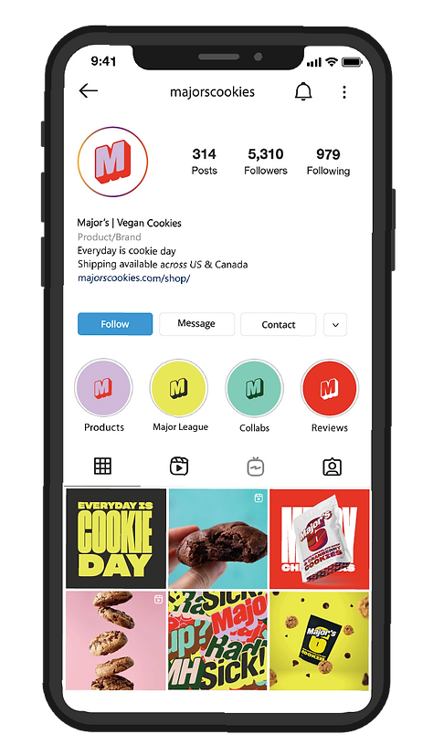
MAJOR'S
Description:
Major's is a vegan baked goods and beverage company based in Toronto, Ontario. Their requirements include brand redesign, social media graphic assets, packaging design, visual design and illustrations.
Role:
Graphic Design
Brand and Packaging Design
Social media content creation
Illustrations
Collaborated with marketing team
Tools:
Adobe Photoshop
Adobe Illustrator
InDesign
Procreate
Overview
Major's needed assistance redefining their brand. They required engaging visual assets targeted at vegan consumers, identified within the Gen-Z age group. My problem solving expertise allowed me create a brand identity that stood out while maintaining visual aesthetic; also specifically tailored to their current marketing goals and objectives.
I had a range of projects with the client, including logo design, brand deck redesign, and packaging design, among others.
HIGHLIGHTS
-
Logo Design and variations
-
Style Guide - Color Palette, Typography, Patterns & Accents
-
Package Design
-
Print Media
-
Digital Media
-
Illustrations
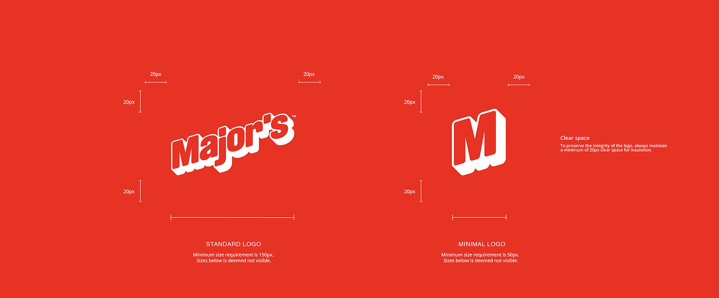
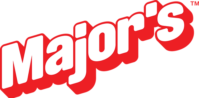
LOGO DESIGN
The client had a clear vision of his brand imagery and I worked very closely to fine tune the ideation process. I used a rough sketch to create the logo and added a finalized touch by slanting the typography ; a touch from the client that gave the original design a nudge.
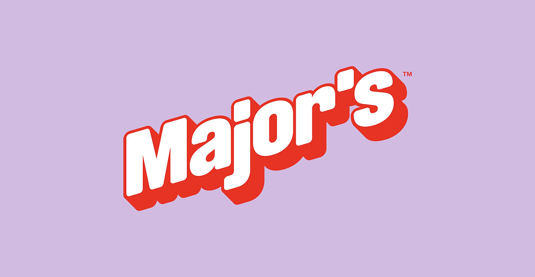
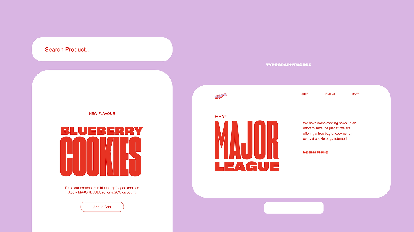
style Guide
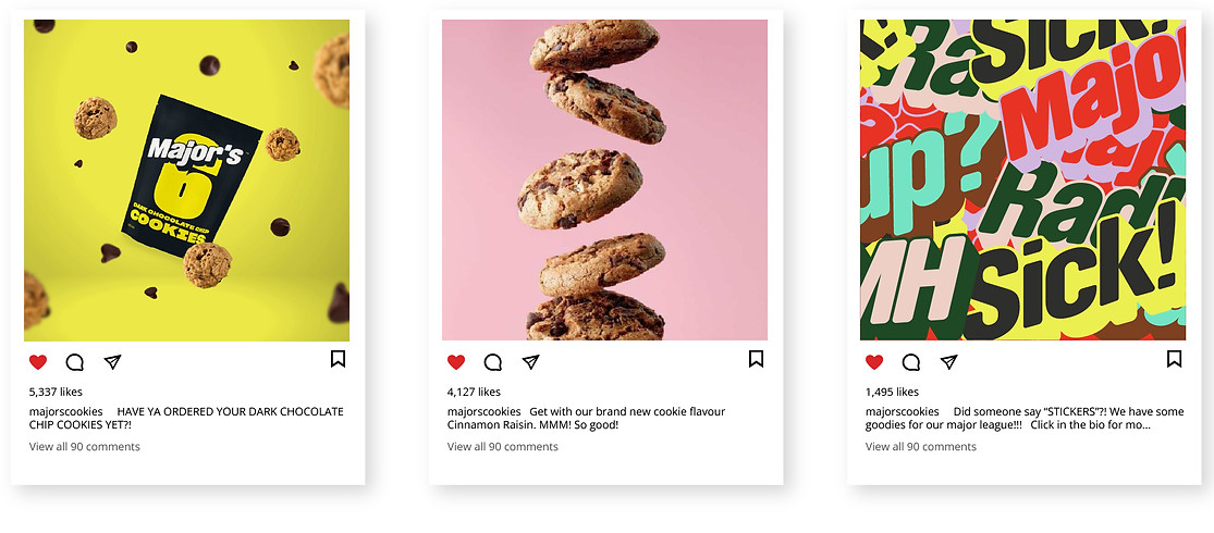
I ensured Major's identity was bold, vibrant and contemporary. It was important to the client that the colors appealed to younger consumers.
A similar direction was taken with the typography selection; Clear, bold and loud. There were many variations of Sharp Grotesk that would fit perfectly.
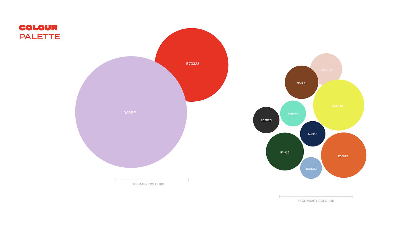
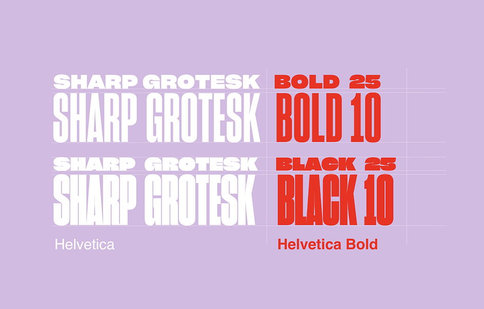
The choice of bold typography was a strategy to direct consumer's attention, laying emphasis on copy or titles. Pairing the typography and colours brought more life and vibrancy to the brand.
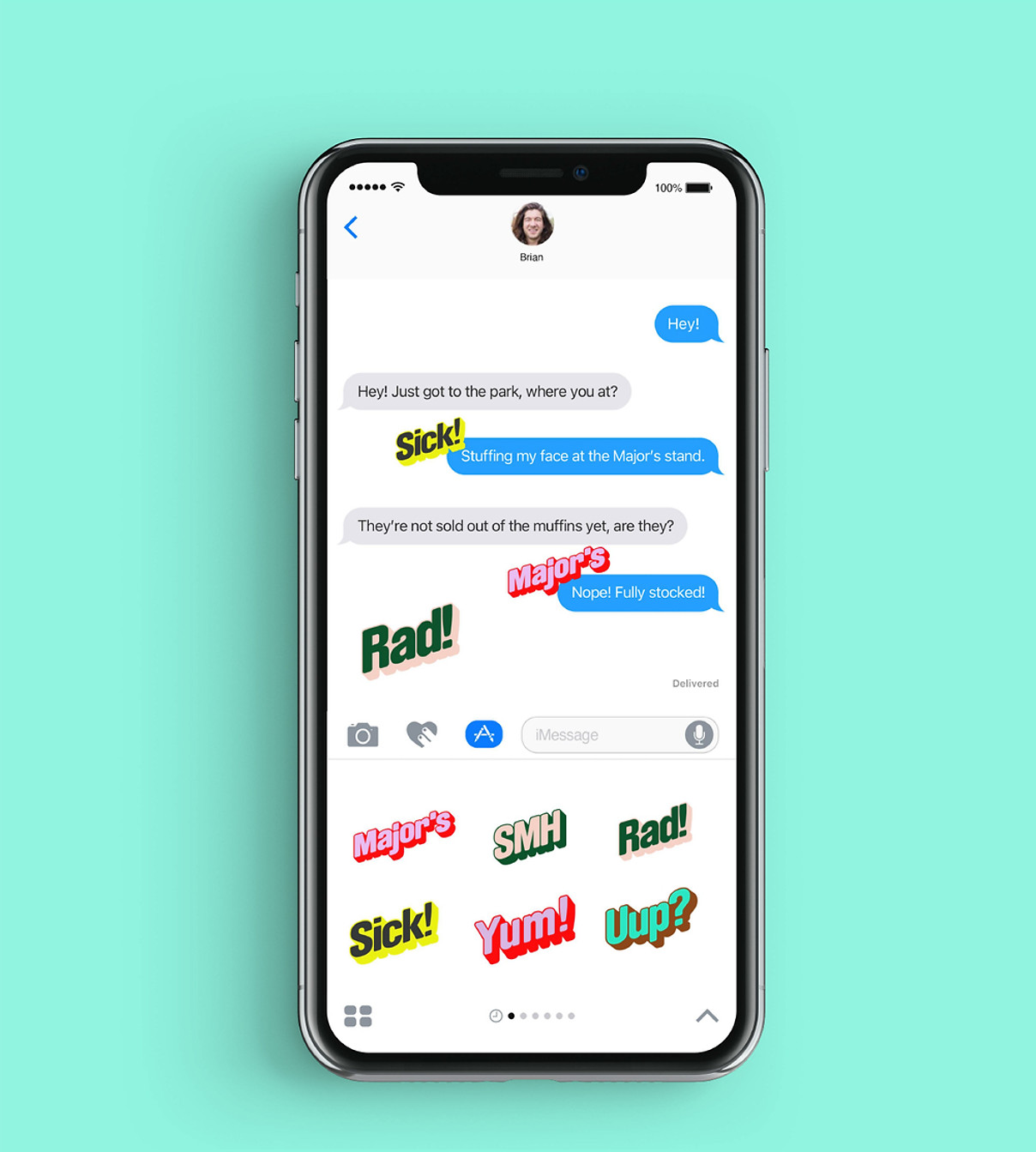
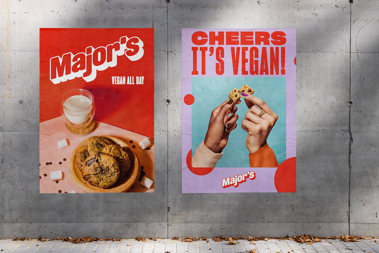
Below, I displayed the use of typography on digital platforms, showing a hierachyical order of placements that will draw viewers to important information.
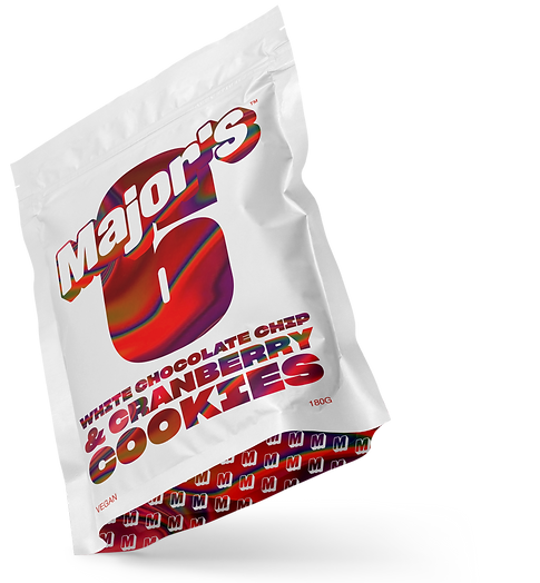
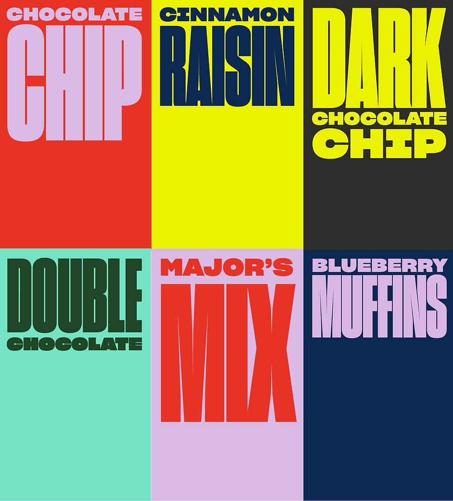
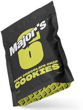
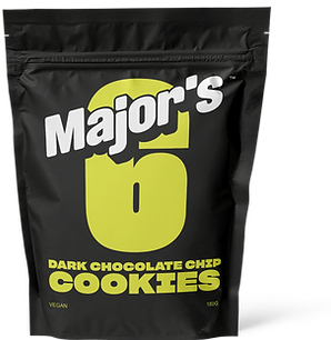
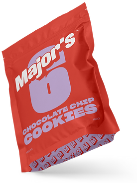
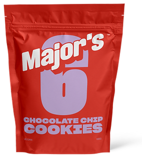
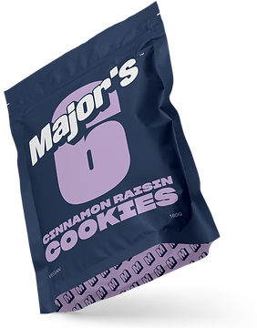
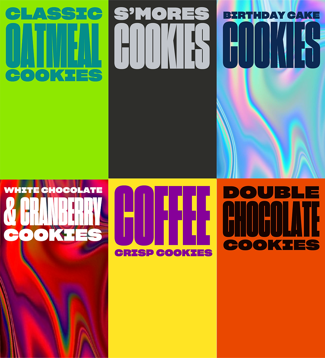
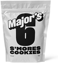
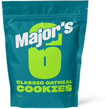
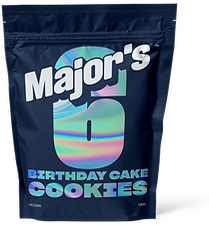
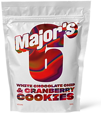
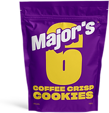
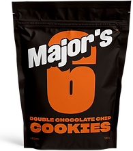
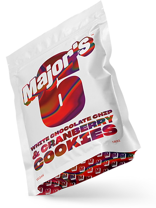
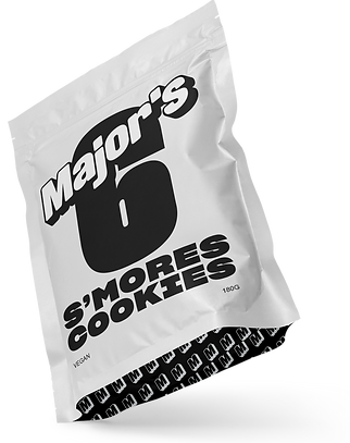
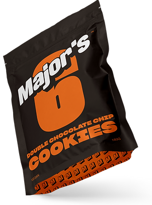
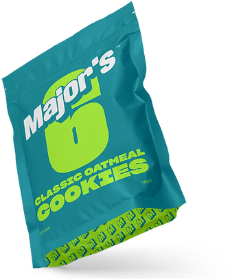
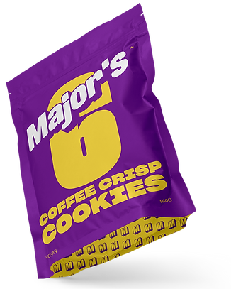
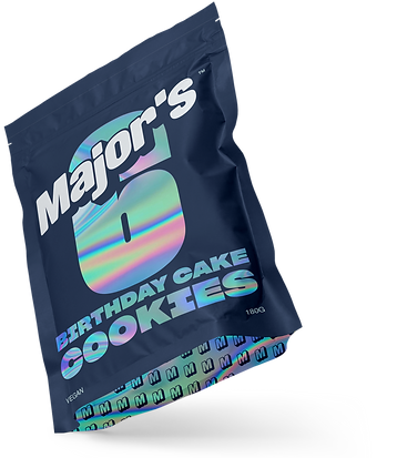
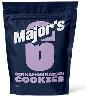
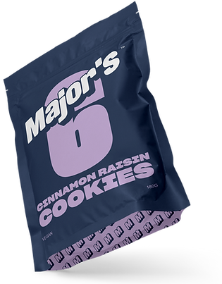
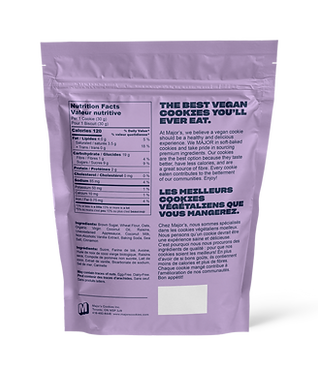
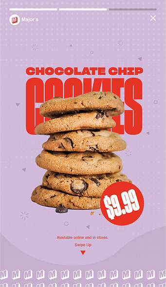
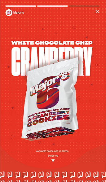
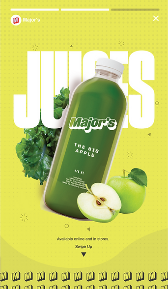
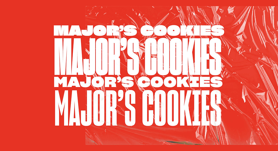
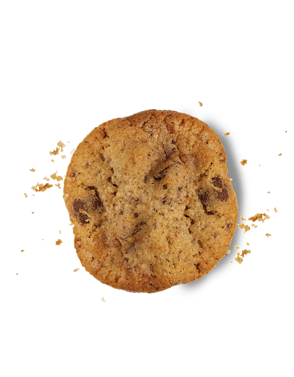
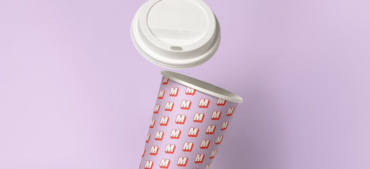
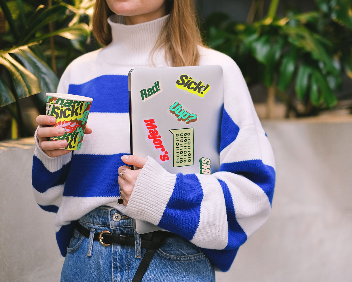
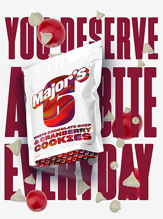
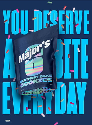
PACKAGE DESIGN
I created visually stunning package designs; 11 new flavour packages for Major's cookies, 9 of which have been launched into the consumer market. My designs were focused on creating a bold and distinctive look that was consistent across all flavours.
As a result, I it created brand awareness and increased consumer attraction. In addition to this, I developed 3D mockups for all products, including Major's juicery.

H: 4.3in W: 10.1in
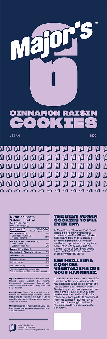
Front Panel Bottom Back Panel
<------------------H: 13.2in W: 9.75in--------------------> <------------------H: 13.2in W: 9.75in-------------------->
Digital media
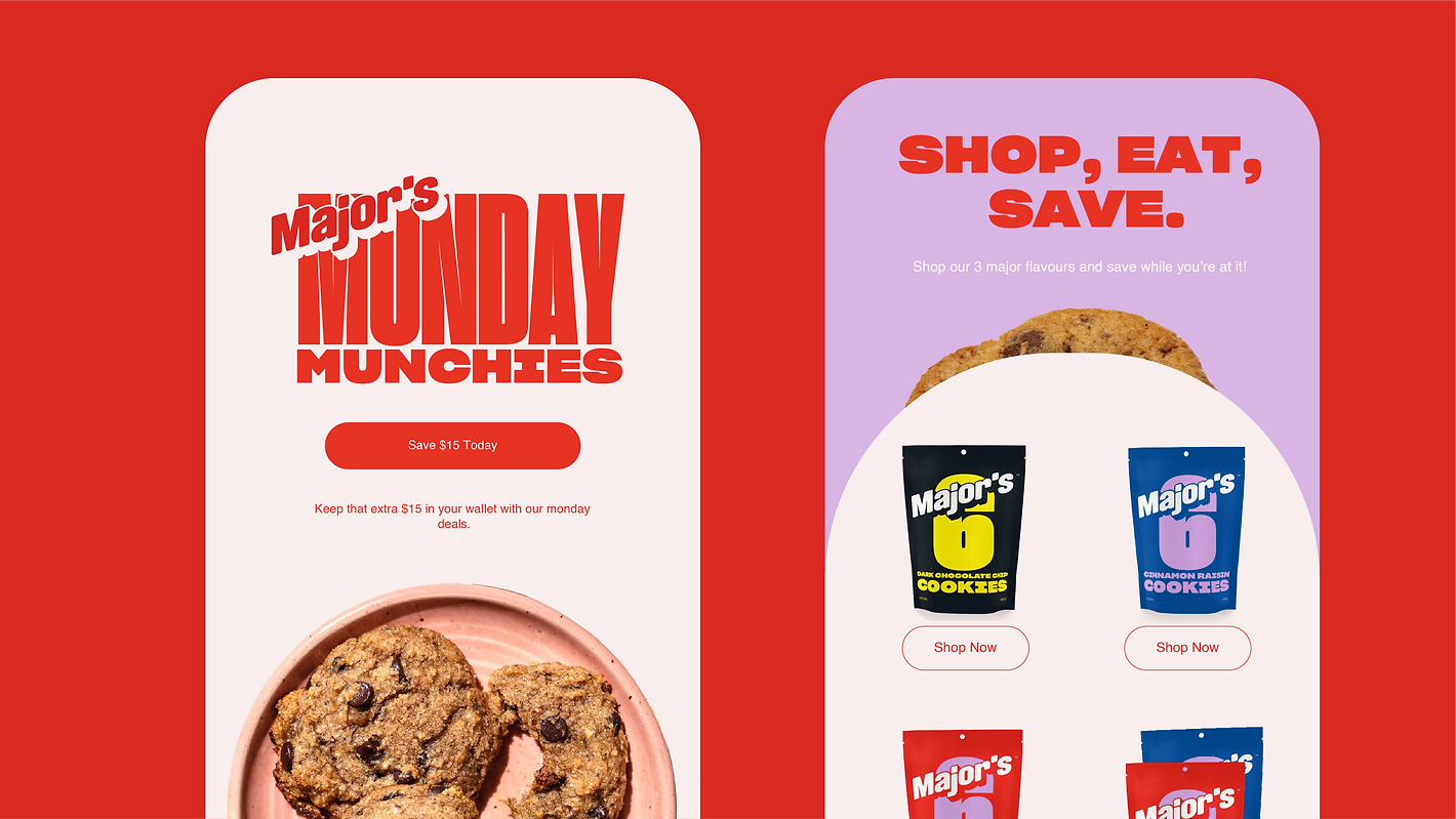
social media
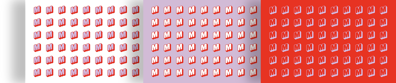
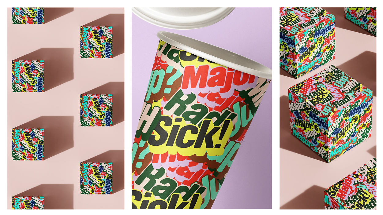
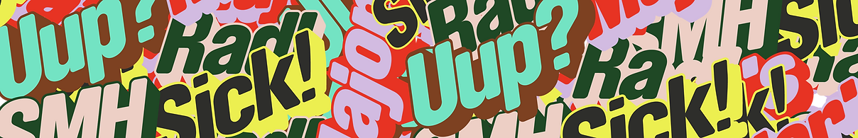
pATTERNS
& ACCENTS
I designed patterns to make the brand look more modern. Including some abstraction with graffiti, I created a bold, contemporary and rhythmic vibe.
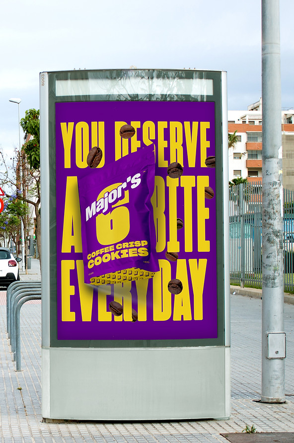
OUTDOOR
MEDIA
illustration
Brainstorming the aesthetic of the storefront, I contributed ideas and visualized with sketches.
This illustration was later used by an interior designer for reference.
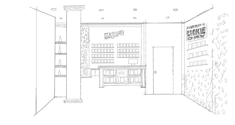
First draft sketch referencing the storefront
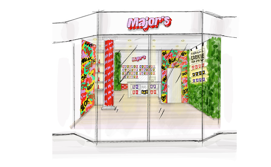
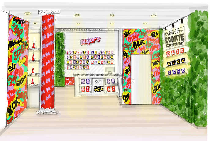
Left - Detailed illustration of the storefront, Right - Detailed illustration of storefront including exterior doors
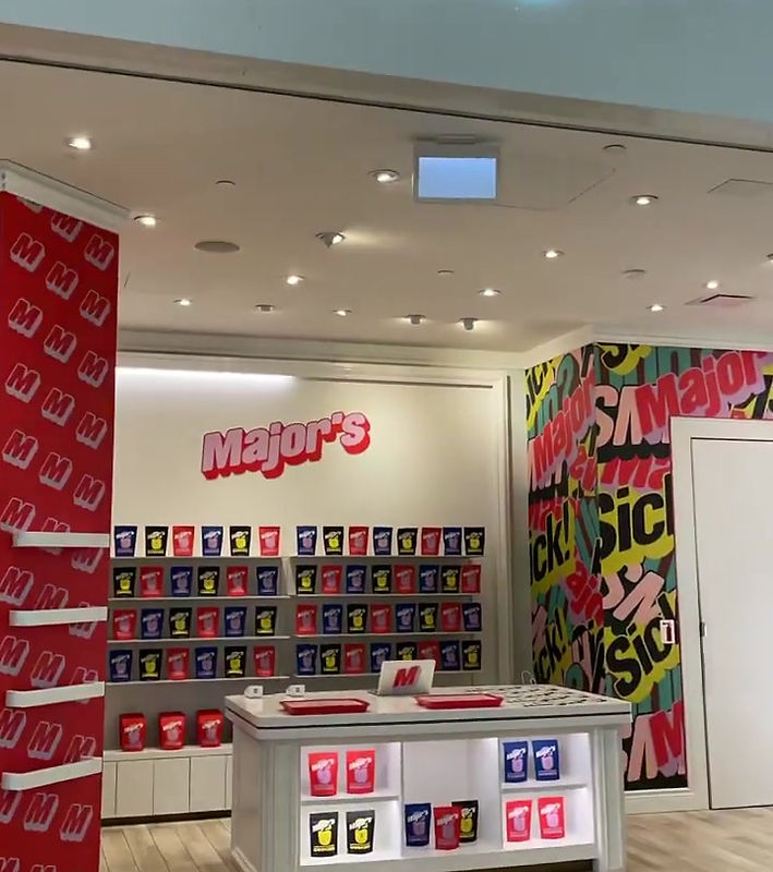
Store at Square One Mall, Missisauga, Ontario.
TAKE-AWAY
I enjoyed every bit of this project (...still ongoing). I've discovered how vital it is to understand both the client and my role as a designer! An enthusiastic client can lead to exciting choices, but it’s essential to set clear limitations to ensure staying focused on effective design solutions.