

kinkee!
Description:
An academic project that focuses on UX research and UI design using digital solutions to solve a niche accessibility problem.
Role:
Product Designer
UI Designer
UX Researcher
Tools:
Figma
Adobe Illustrator
Sketch Pad
Overview
Kinkee is a digital solution created to connect colored women with afro-textured hair to stylists within their location providing ease of access through a geolocation-based application.
This case study focuses on using technology to fix a common accessibility problem among a demographic in the beauty and haircare industry.
HIGHLIGHTS
-
Problem
-
Solution
-
Process - Research, Strategy, Design
-
Prototype
-
Takeaway
PROBLEM
Colored women in north america have been shown to have spending power on beauty services (specifically hair) but the hassle they run into is simply finding services that cater to their hair care needs. Kinkee was born out of a personal experience of struggling to find hair services tailored to afro-textured hair.
The purpose of this project is to solve a common problem for colored women in north america which is access to stylists that cater to afro-textured hair.
$54.4 Million
total spend linked to the ethnic hair and beauty market in Canada and USA
$14.7 billion
expected global online on-demand home services market by 2030
35%
Of personal funds are spent on hair services by colored women with afro textured hair
72%
Percentage of colored people that have access to smart devices

PLAN
To build a geo-location based application with a simplified process of connecting hair stylists to colored women in need of afro hair care services within close proximities.
The afro hair care market is dominated by small, independent businesses. This suggests that entrepreneurship has played a significant role in the growth and development of the black hair care industry.
PROTOTYPE
Give it a shot! Your task is to set up an account, select the hair servicer closest to you and book an instant appointment.
notes
Despite being a common problem among colored women I had to understand the real behaviour and demographic I was designing for. Originally intended for a target demographic in Canada, I had to expand the region to North America, having faced a challenge in finding enough statistics to back my research for just Canada.
I created a set of questions for user interviews asking a subset of 35 women of color with afro-textured hair to understand the problem better. Final selected demographic was working class colored women between ages 18 - 40. The age range of financial dependence and internet adopters.
OPPORTUNITY
The global online on-demand home services market is expected to reach USD 14.7 billion by 2030, including the personal care industry.
This will change the way people interact with services, enabling them adapt for convenience and accessibilty
RESEARCH
The findings from my interview led me to the conclusion that
1
It is difficult to find services that cater to afro-textured hair and when found can be hard to locate. It's usually a case of 'word of mouth' to get information on such services.
2
Interviewers preferred to have a platform similar to uber where they can easily have access to hair care services based on their specific preferences. They voted in favour in having the service come to them.
3
Interviewers agreed their first resort to be searching google for hair services that cater to hair care around them.
ON THE CONTRARY
I found that afro-textured hair is not only limited to colored women though the majority percentage of women with afro-texured hair are known to be black women.
I had a moment to rethink my entire study an concluded that I can have a selected demographic but also be inclusive to other races with the common problem.
CONCLUSION
Using this information, how can I create accessibility for colored women to their desired hair care services within their communities.
personas
I had 2 personas, one proto persona and one original persona. The behaviour and demographics influenced the user flow and features of the application.
Nabila Williams
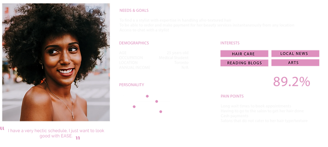
Zara and Hailey Alden

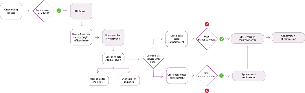
USER FLOW
This user flow depicts the journey of a persona in need of an instant or dated hair appointment. With very limited time to delve deeper, I focused on a specific user journey of visitors in need of a service.
Developing
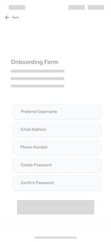
wireframes

I re-adjusted my original sketches a few times to accomodate pain points from my sample size testers. They ran into a few moments of hesitation, which halted their flow. After revision and brainstorming, I concluded a seamless user flow with low fidelity wireframes.


My initial style guide was created without consideration of spacing and button sizes and overall UI best practices. Due to time contraints, I designed blindly. I revisited the UI style guide and changed a few components to be more user friendly.
STYLE GUIDE
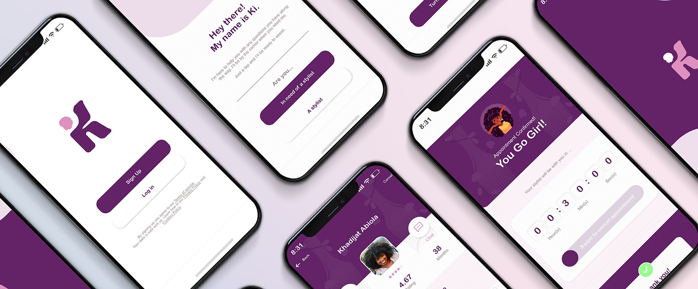
For legibility, I used high contrasting colours. The colour palette highlighted femininity and boldness with a bit of subtlety. I illustrated a mascot with female feature, as an interactive element to create personalization and help users through their journey.

I leveraged my illustration skills to create an interactive character named, 'Ki'. I used a range of facial expressions to create static animate. The illustrations were stategically placed engage users along the on-boarding process.

ITERATIONS
Before


After

I redesigned the interface to look more simplistic and easy to navigate. The previous design led users to believe that the location and search bars were clickable buttons, which was not the intention.
I recreated those functions as visible bars and utilized an icon for the filter button. I replaced the lower search icon with a home button to avoid a case of repitition.
The previous design had the services itemized and clustered together, not leaving room for clickability. I had originally made use of multiple font families that weren't cohesive.
The updated user interface addressed the inconsistencies and made the selection process seamless and options were more legible.
Before


After

Before


After


The original typography and spacing were visually chaotic, making users spend too much time struggling to read the information.
With feedback, I recreated the look ensuring hierarchy in font sizing and incorporated best practices for UI spacing. I implemented a feature for users to be able to view their receipts and an option to download it.
SOLUTION
I incorporated all the feedback and developed high fidelity interfaces. I applied my knowledge of brand design to develop the logo and style guide for the mobile application. I implemented an interactive touch using a personalized mascot.
Hair services delivered at your doorstep
Users can easily search for and specifically find stylists that cater to their hair care needs within their proximity, either for an instant or scheduled appointment.
They can filter services to fine tune searches, select any avaialble servicers instantaneously and download receipts for record purposes.


Chat or call hair servicers instantaneously
Users have the option to discuss specific requirements via chat or call, for services before their appointment.
Select the hair service of your choice
Users have a range of their preferred hair services to select from, based on the servicers area of expertise. Prices are listed for transparency and the total is calculated automatically.
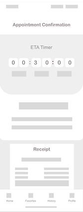
Track your servicers ETA
Once a service has been selected, users are able to track the estimated time their servicer will arrive with the help of an interactive timer.

TAKEAWAY
Every project is a new opportunity to learn and that's what I enjoyed most on this project. Incorporating feedback to make designs better. Other things I learned...
1
Find the right people to ask the right questions. You get the design solutions from the pain points users might experience.
2
Don't assume. A rookie mistake a lot of designers make, myself included. Tests and interviews do the work the right way.
3
I learned that it's great to refine and specify your target audience but behaviours for each user still differs. Find a common ground to satisfy at least 85% of users.